This blog will cover the whole edit of the image so if you have never used masks before, then don't worry I will cover everything as though the reader hasn't used masks before. However, if you are used to masking and just want to see the part about selecting specific colours then you can scroll to the bottom and read the last section.
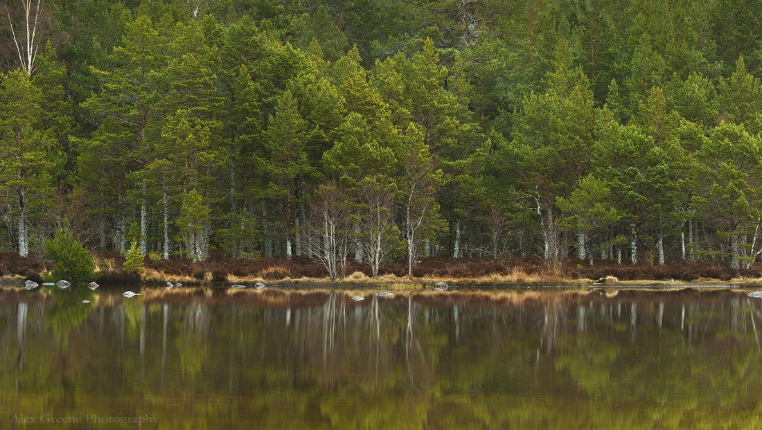
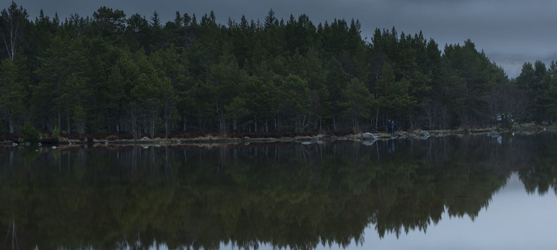
So, how did I get from the panorama below to the shot above?
Well, I'll start with how I shot it, because that makes the biggest difference (there's only so much Photoshop can do). The nine image panorama was photographed underexposed as I was shooting on a D800e and knew that I could shoot for the highlights and capture some detail in the mountain that you can see on the far right of the image. In the end I didn't use that part of the photograph, but with the D800e's ability to capture such a large dynamic range I was able to brighten the image and start to see the results that you see above. If you are shooting on a crop sensor, then it may be worth (if you were in the same situation) shooting the scene slightly brighter and getting less noise in the shadows.
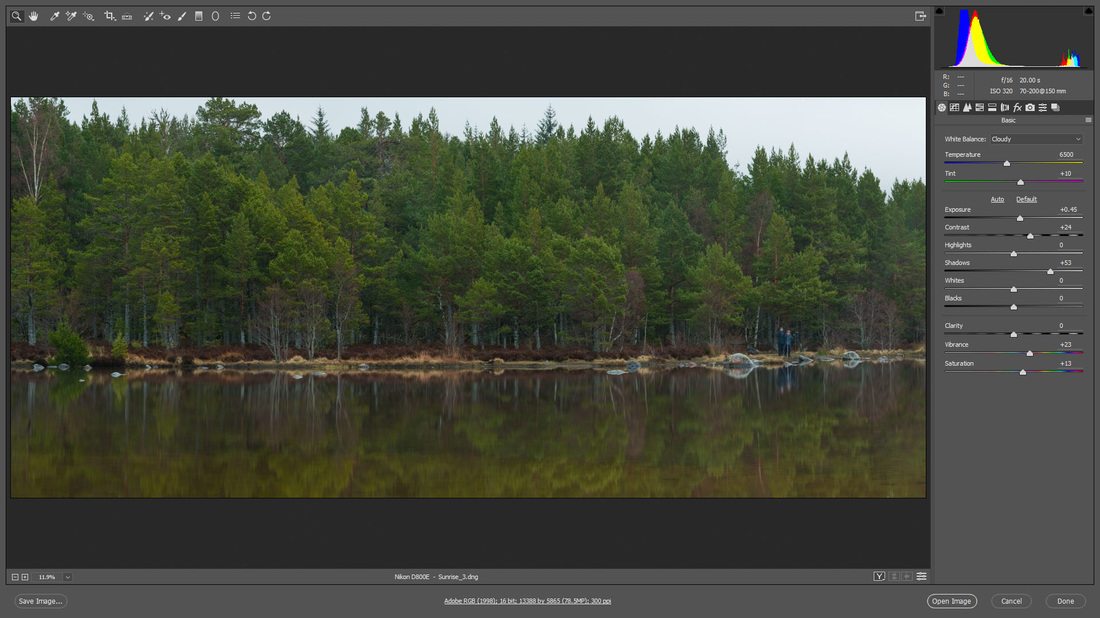
As I said before, you can't (or I personally don't want to) capture a scene and then completely change the 'light' to achieve a new look - I would say that is starting to branch a more 'digital art' type of picture. So I start by opening the panorama in CameraRaw and using the basic adjustments to get as close to the final result as possible.
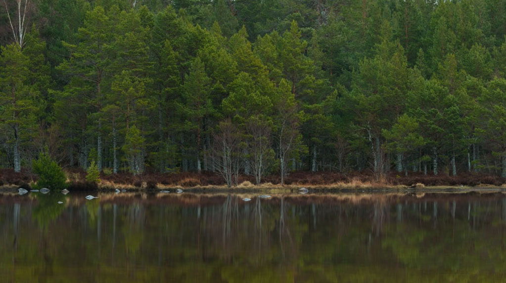
| The crop that you can see above is how I originally pictured my final image to be framed, however this changed quite a lot after spending some time in Photoshop. To quickly talk you through the initial changes; I bought up the exposure closer to how it was to the eye when we were there (although looking at it now, I could have gone to about +0.70 and saved myself some steps later). There was no detail in the brightest areas that I wanted to save and so highlights stayed at 0. I increased the shadows to bring some detail into the shaded areas under the trees as I really like the silvery trunks (which is one part of the image that I 'make pop' later). Saturation and vibrance are purely a matter of taste, I liked the greens to be strong and in the light that we had that morning the colours were quite bland. |
This is how it was imported in Photoshop and now comes the part when you chose which bits of the image you want brighter/darker, which colours you want more/less saturated and make the final global adjustments like brightness/contrast.
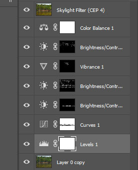
| Here are all of the layers that I used to achieve the final image. The top layer (skylight filter CEP4) is from the nik color efex package, but basically it gives a slight warmth and brightness, so that could be recreated through basic adjustments. As you can see there are four layer masks in which the masking looks very spotty (for lack of a better word). These are the layers that are only applying their adjustment to certain colours. |
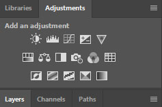
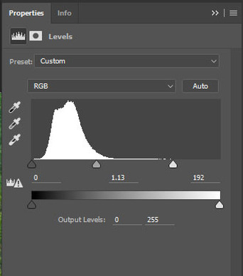
| The first adjustment was with the 'levels'. By moving the right hand arrow to the left, you are moving all of the data to the right of the histogram and therefore making the image brighter. This gave me a good starting point, the image was now at the brightness I wanted and it was quite flat (i.e. there was little contrast). The next adjustment was a curves layer and this was one that I knew I wanted to only be in a specific part of the image. Using the curves I had added some brightness but mostly contrast and I didn't like what |
I should quickly explain how the colour of your brush effects the mask. Basically, black means that it won't show up and white means that you will see the changes you've made. In this first case, I left the layer as white and painted black because I wanted that small area to not be affected by the adjustment. If I only wanted a small portion to show through, then it would make sense to make the mask black and paint the area that I wanted in white. You can make the mask black by inverting it, this is done by using 'CTRL i' or 'command' on a mac.
***********
Now comes the part when I used selective masking by picking certain colours. I don't need to cover each layer from now on, because you'll understand the concept if I just explain the mask I used to make the trees 'pop'.
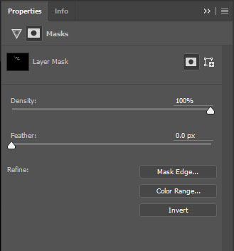
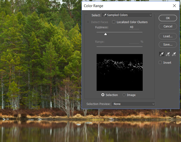
I started by making a vibrance adjustment and making the effect quite strong - I overdid the effect so that I could easily tell the areas that I had changed and then I went back and lowered the adjustment after completing the mask. Once you have done the adjustment, double click on the mask (white box) and another box will appear that looks like the one below.
I used exactly the same technique to brighten the trunks of the trees. If I didn't know about selecting colours I would have increased the brightness and made a mask on which I would have to paint each trunk that I wanted to be brighter. That technique would have taken a long time, but by using the colour range tool, you can just click on one of the trunks and the adjustment will instantly apply to all the trunks and only the trunks!
By using layer masks you should see a big improvement in your images, mostly because you will find them looking very close to how you pictured the image at the time you took the shot. The changes will seem minimal, like all of the ones that I made on this example, but overall it adds another level to your picture. That extra something might not be noticeable to other viewers, but I personally am much happier with my images since I learnt about this method of masking!
Thanks for reading and I hope that it helps you somehow!

